Theme & Fonts
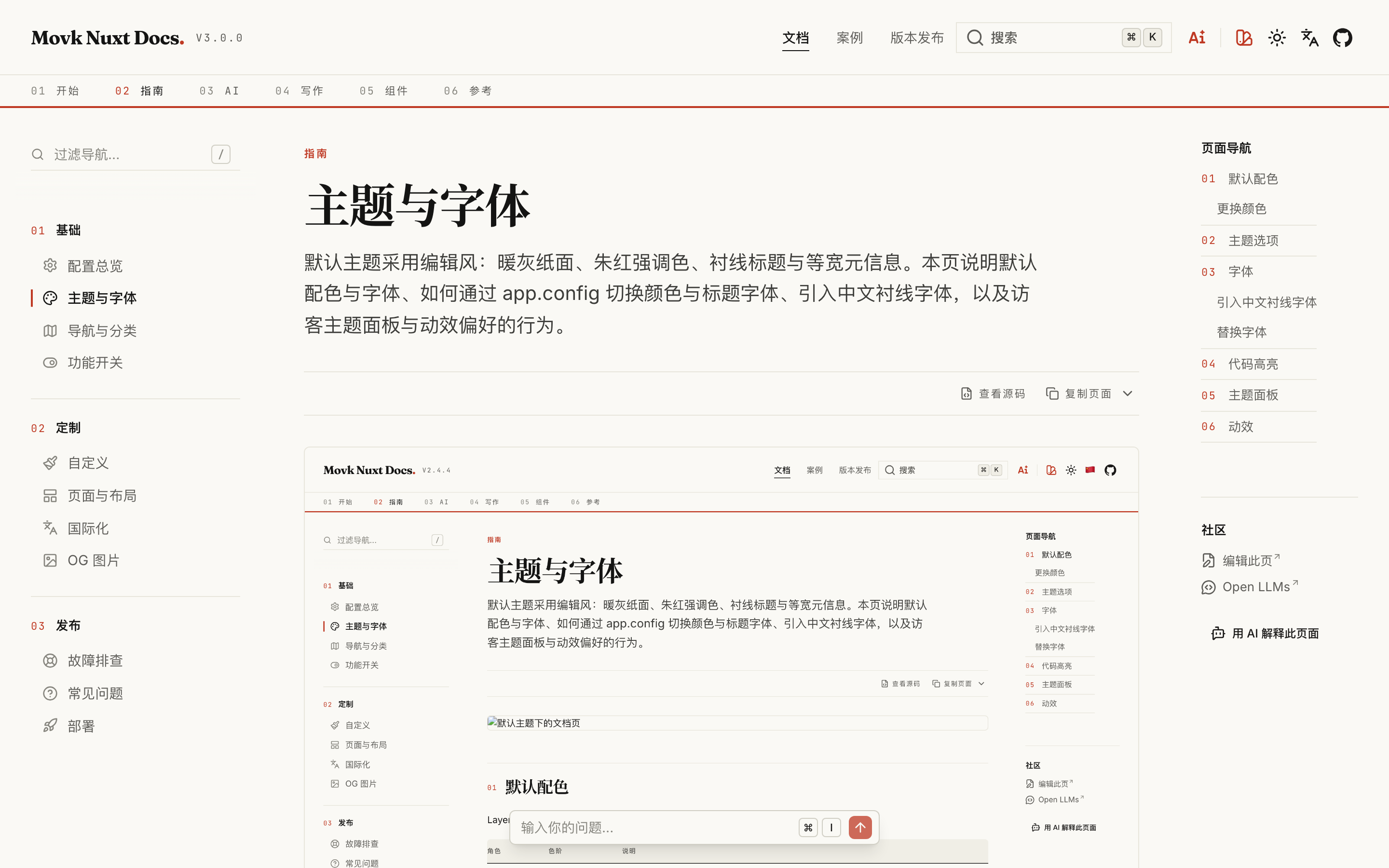
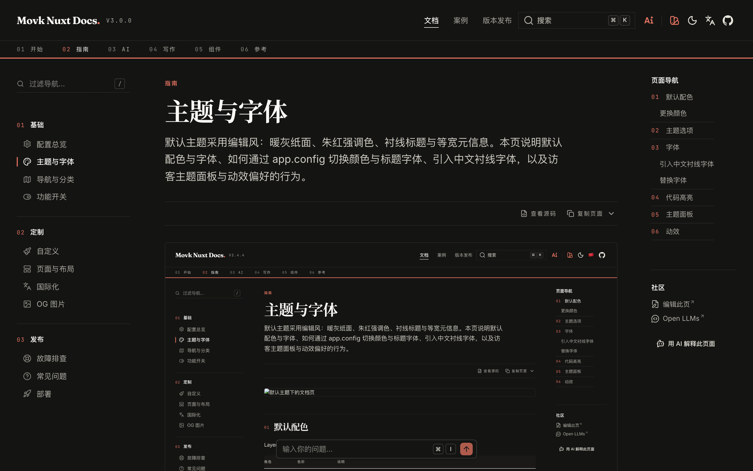
Default colors
The layer ships two custom color scales and sets them as the Nuxt UI defaults:
| Role | Scale | Notes |
|---|---|---|
primary | vermilion | Vermilion red, 500 is #d64b34. Light mode uses 600, dark mode uses 400 |
neutral | paper | Low-chroma warm gray, 50 is #faf9f5 (light background), 950 is #141413 (dark background) |
Background, text and border colors are all derived from the current neutral scale: light mode uses 50 for the background and 900 for text, dark mode uses 950 and 200. Any neutral you pick keeps the same paper-and-ink contrast.
Changing colors
Set any Tailwind CSS color name or custom scale in app.config.ts:
export default defineAppConfig({
  ui: {
    colors: {
      primary: 'emerald',
      neutral: 'zinc'
    }
  }
})
A custom scale must declare all shades from 50 to 950 with @theme in app/assets/css/main.css:
@theme static {
  --color-brand-50: #eef6ff;
  --color-brand-100: #d9eaff;
  /* ... */
  --color-brand-950: #0b1d3a;
}
export default defineAppConfig({
  ui: {
    colors: { primary: 'brand' }
  }
})
app/assets/css/main.css into its own Tailwind root. Do not add @import "tailwindcss" there: it creates a second copy of the utilities that overrides the layer's responsive styles, and the build prints a warning.Theme options
The theme group controls the layer's own visual options:
export default defineAppConfig({
  theme: {
    radius: 0.25,
    blackAsPrimary: false,
    icons: 'lucide',
    font: 'editorial',
    grain: false
  }
})
| Field | Default | Description |
|---|---|---|
radius | 0.25 | Global border radius in rem |
blackAsPrimary | false | Use black (white in dark mode) as the primary color |
icons | 'lucide' | UI icon set; the theme picker can switch between lucide, phosphor and tabler |
font | 'editorial' | editorial uses serif headings; sans uses sans-serif everywhere, with Inter for headings |
grain | false | Overlay a paper grain texture on the background only, never on text or code blocks |
Fonts
The layer self-hosts three variable fonts through Fontsource, Latin subsets only:
| Usage | Font | CSS variable |
|---|---|---|
| Body | Inter | --font-sans |
| Headings | Fraunces | --font-serif, --font-display |
| Code and metadata | JetBrains Mono | --font-mono |
The layer disables the @nuxt/fonts integration of Nuxt UI, so no other fonts are downloaded at build time. CJK characters follow the font stacks:
- Sans-serif: Alibaba PuHuiTi (loaded by you) → PingFang SC → Hiragino Sans GB → Microsoft YaHei → Noto Sans CJK SC
- Serif: Noto Serif SC → Source Han Serif SC → Noto Serif CJK SC, falling back to bold sans-serif when none is installed
System Song fonts often lack a bold weight, so they are not part of the serif stack.
Adding a Chinese serif font
For serif Chinese headings, load Noto Serif SC yourself. The Fontsource package is split by unicode-range, so pages only download the characters they use:
pnpm add @fontsource/noto-serif-sc
npm install @fontsource/noto-serif-sc
yarn add @fontsource/noto-serif-sc
bun add @fontsource/noto-serif-sc
/* Headings only use the bold weight */
@import "@fontsource/noto-serif-sc/700.css";
To use Alibaba PuHuiTi for Chinese body text, load a stylesheet that hosts it from app.head in nuxt.config.ts. The font family must be named Alibaba PuHuiTi:
export default defineNuxtConfig({
  app: {
    head: {
      link: [
        { rel: 'preconnect', href: 'https://cdn.example.com', crossorigin: '' },
        { rel: 'stylesheet', href: 'https://cdn.example.com/fonts/alibaba-puhuiti.css' }
      ]
    }
  }
})
Replacing a font
Override the CSS variable to replace a whole font family:
@import "@fontsource-variable/source-serif-4/index.css";

@theme {
  --font-serif: 'Source Serif 4 Variable', 'Noto Serif SC', serif;
}
Syntax highlighting
Code blocks use the Shiki themes github-light and github-dark, switching with the color mode. Override them in nuxt.config.ts:
export default defineNuxtConfig({
  content: {
    build: {
      markdown: {
        highlight: {
          theme: { default: 'vitesse-light', light: 'vitesse-light', dark: 'vitesse-dark' }
        }
      }
    }
  }
})
Theme picker
The swatch button in the header opens the theme picker, where visitors can adjust the primary color, neutral color, radius, icon set and color mode.
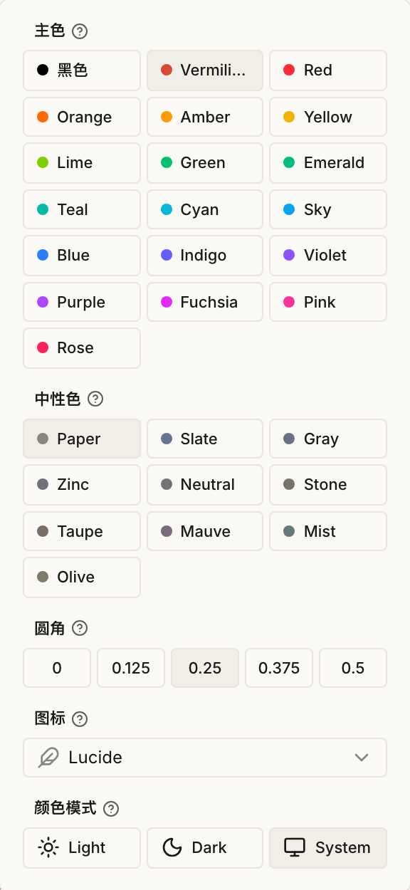
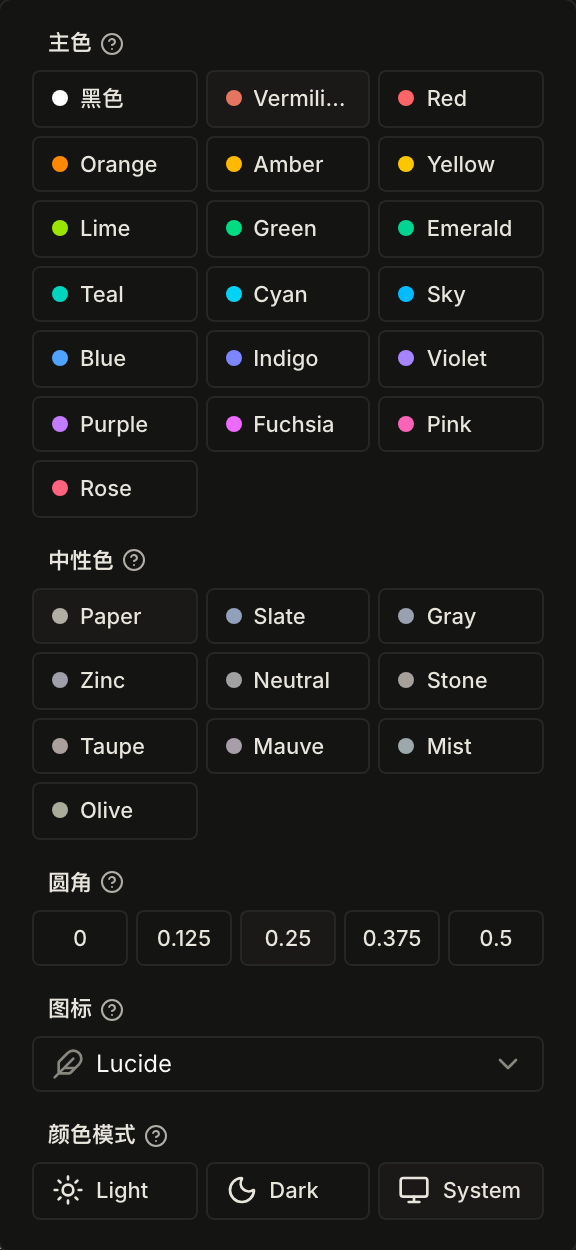
- Choices are stored in the visitor's
localStorageand only affect that visitor - The picker compares against your
app.config, so "Reset" restores your site configuration, not the layer defaults - "Export" copies the matching CSS variables or an
app.config.tssnippet, so you can write a tuned palette back into your site config
Motion
Page navigation uses View Transitions: the title morphs between pages while the header and sidebar stay still. When the visitor's system enables reduced motion (prefers-reduced-motion: reduce), View Transitions, the sliding sidebar indicator and other transitions are all turned off.
FAQ
Answers to common questions about Movk Nuxt Docs, from how it relates to the Nuxt UI docs template, package managers and Node.js versions, and single-language sites, to turning off GitHub, using other AI providers, upgrading, overriding components and static hosting limits.
Navigation & Categories
Header links, the mobile menu and sidebar groups are declared in app.config, while the docs directory structure drives the section bar and the sidebar order. This page covers where each navigation comes from, localized labels and link prefixes, sidebar grouping rules, the sidebar filter and ⌘K search.