Customization
- Difficulty
- Advanced
How overriding works
Create a component with the same name in your component directory (such as app/components/) to replace the layer's implementation. The component name comes from the file name only, so app/components/HeaderLogo.vue and app/components/header/HeaderLogo.vue both register as HeaderLogo.
app.config (header.nav, footer.credits, ui.colors and so on) over overriding components, see Configuration Overview.Overrides usually rely on these auto-imported composables:
| Function | Purpose |
|---|---|
useAppConfig() | Read site config such as header.title and footer.socials |
useMovkI18n() | Current locale, built-in translations via t(), locale-prefixed localePath() |
useHeader() | Resolved header links desktopLinks / mobileLinks |
useDocsNavigation() | The docs navigation tree of the current locale |
Override contract
The components below are the ones v3 commits to: their names, mount points and props stay stable within v3.x, and none of them take props. Components not listed (such as ThemePickerButton and HeaderToggleButton) are internal and may change between versions, so overriding them is not recommended.
| Component | Mounted at |
|---|---|
Header | Top of every page; not rendered when the route's meta.header is false or the path starts with /examples |
HeaderLogo | Left side of the header |
HeaderCenter | Center of the header, desktop only |
HeaderCTA | Right side of the header, after the search box |
HeaderBody | Mobile navigation drawer |
HeaderBottom | Below the header, docs pages only |
LanguageSwitcher | Right side of the header, when i18n is enabled with more than one locale |
ThemePicker | Right side of the header |
PageHeaderLinks | Right end of the metadata row below the page lead |
DocsAsideLeftTop | Top of the left sidebar, only when the navigation filter is shown |
DocsAsideLeftBody | Body of the left sidebar, and the docs navigation in the mobile drawer |
DocsAsideRightBottom | Below the table of contents, desktop only |
Footer | Bottom of every page; not rendered when the route's meta.footer is false or the path starts with /examples |
FooterLeft | Left side of the footer |
FooterRight | Right side of the footer |
ComponentExampleExtras | Example container of ComponentExample and ComponentCode, requires movkNuxtDocs.componentDocs, see ComponentExample |
The default implementations live in layer/app/components; read the source before overriding.
Header
Header
The header container, combining the logo, main navigation, search, theme picker, color mode and language switcher. Overriding Header changes how every header sub-component below is mounted, so only do it when you need a completely different header structure.


<template>
  <UHeader>
    <template #left>
      <HeaderLogo />
    </template>

    <HeaderCenter />

    <template #right>
      <UContentSearchButton />
      <UColorModeButton />
    </template>

    <template #body>
      <HeaderBody />
    </template>
  </UHeader>
</template>
HeaderLogo
Shows header.avatar and the site title, linking to header.to.


<script setup lang="ts">
const { localePath } = useMovkI18n()
</script>

<template>
  <NuxtLink :to="localePath('/')" class="flex items-center gap-2">
    <img src="/logo.svg" alt="" class="size-6">
    <span class="font-display text-xl font-bold">My Docs</span>
  </NuxtLink>
</template>
HeaderCenter
Desktop main navigation, rendering header.nav.


<script setup lang="ts">
const { desktopLinks } = useHeader()
</script>

<template>
  <UNavigationMenu :items="desktopLinks" variant="link" />
</template>
HeaderCTA
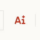
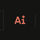
The call-to-action area on the right of the header. By default it shows the AI entry when AI Chat is enabled and is empty otherwise.
<template>
  <UButton label="Get started" to="/docs/getting-started" size="sm" class="hidden md:inline-flex" />
</template>
HeaderBody
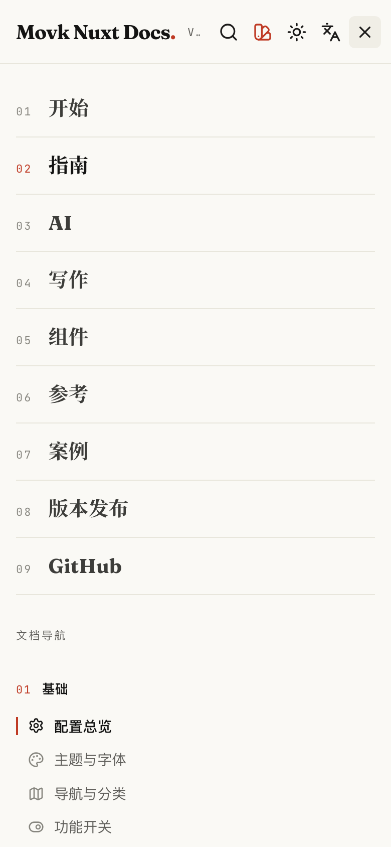
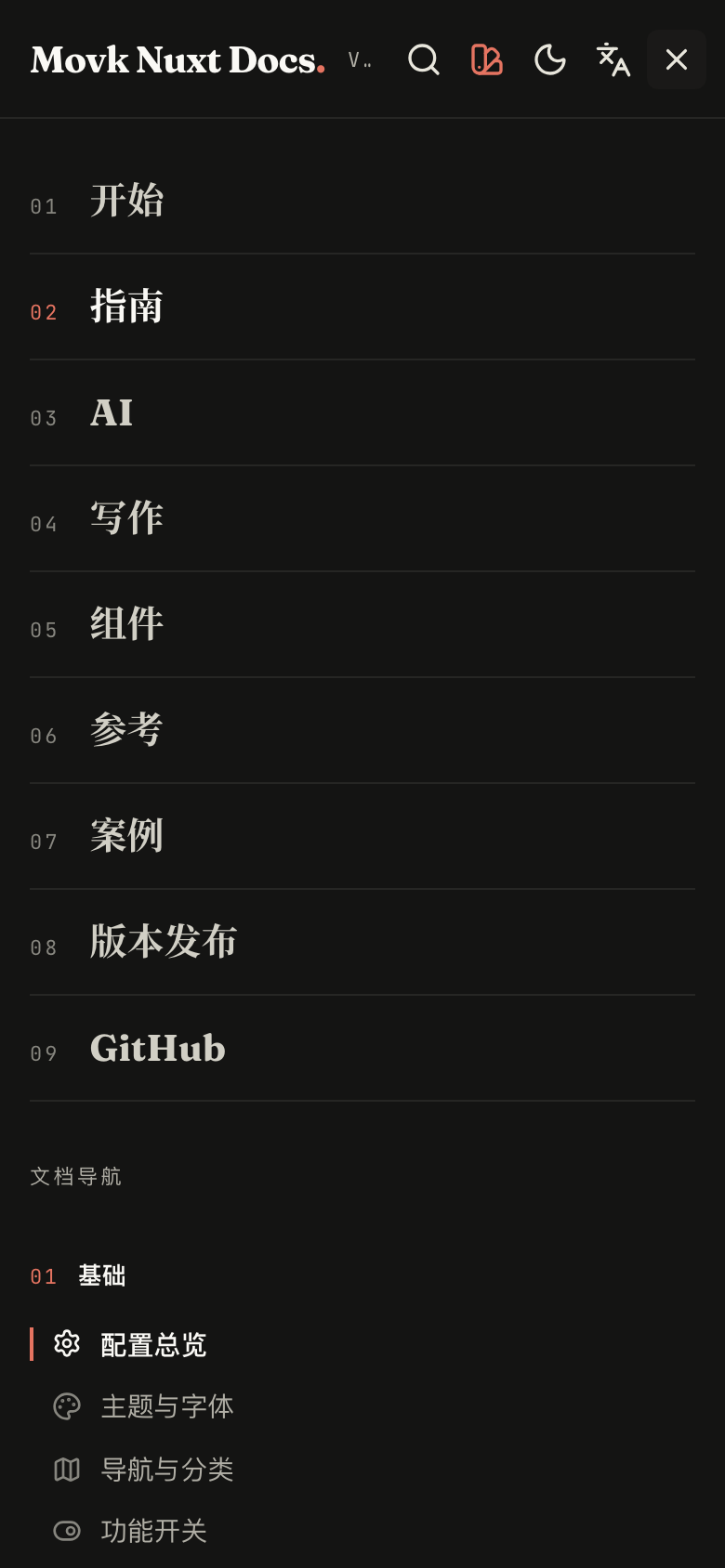
Content of the mobile navigation drawer: numbered header.mobileNav links, followed by the sidebar navigation on docs pages.
<script setup lang="ts">
const { mobileLinks } = useHeader()
const isDocsRoute = useDocsRoute()
</script>

<template>
  <UNavigationMenu :items="mobileLinks" orientation="vertical" />

  <DocsAsideLeftBody v-if="isDocsRoute" class="mt-6" />
</template>
HeaderBottom
The numbered section bar below the header on docs pages; its bottom line doubles as the reading progress bar. An override has to implement reading progress itself.


<script setup lang="ts">
const navigation = useDocsNavigation()
</script>

<template>
  <UContainer class="hidden lg:flex gap-6 h-12 items-center border-t border-default">
    <ULink v-for="item in navigation" :key="item.path" :to="item.path" class="text-sm">
      {{ item.title }}
    </ULink>
  </UContainer>
</template>
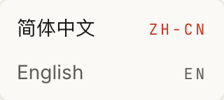
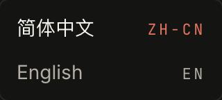
LanguageSwitcher
The language switcher shown when internationalization is enabled with several locales.
<script setup lang="ts">
const { locale, locales, switchLocalePath } = useMovkI18n()
</script>

<template>
  <div class="flex gap-2 text-sm">
    <NuxtLink
      v-for="item in locales"
      :key="item.code"
      :to="switchLocalePath(item.code)"
      :class="item.code === locale ? 'text-highlighted' : 'text-muted'"
    >
      {{ item.name }}
    </NuxtLink>
  </div>
</template>
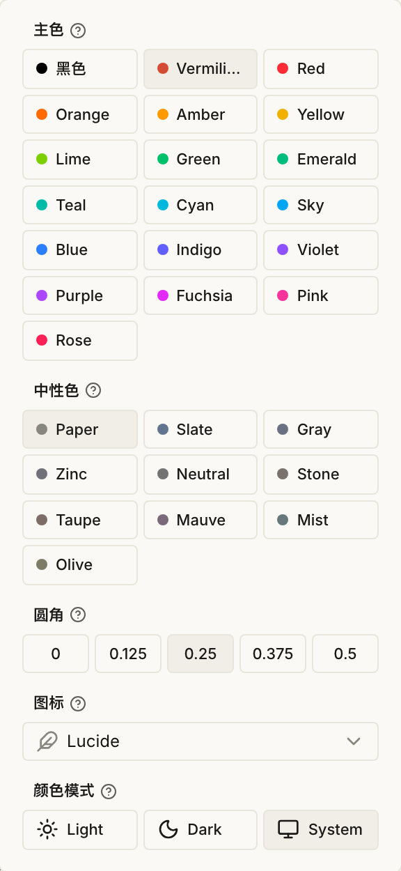
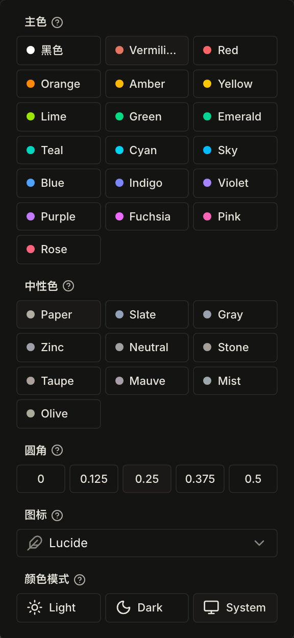
ThemePicker
The visitor theme picker for primary color, neutral color, radius, icon set and color mode, with config export, see Theme & Fonts. Override it with an empty component if you do not need it:
<template>
  <span class="hidden" />
</template>
Docs pages
PageHeaderLinks
The "Copy page" button and dropdown at the right end of the metadata row: copy the Markdown link, view as Markdown, open in ChatGPT or Claude, and, when MCP is enabled, copy the MCP URL or add it to VS Code and Cursor.
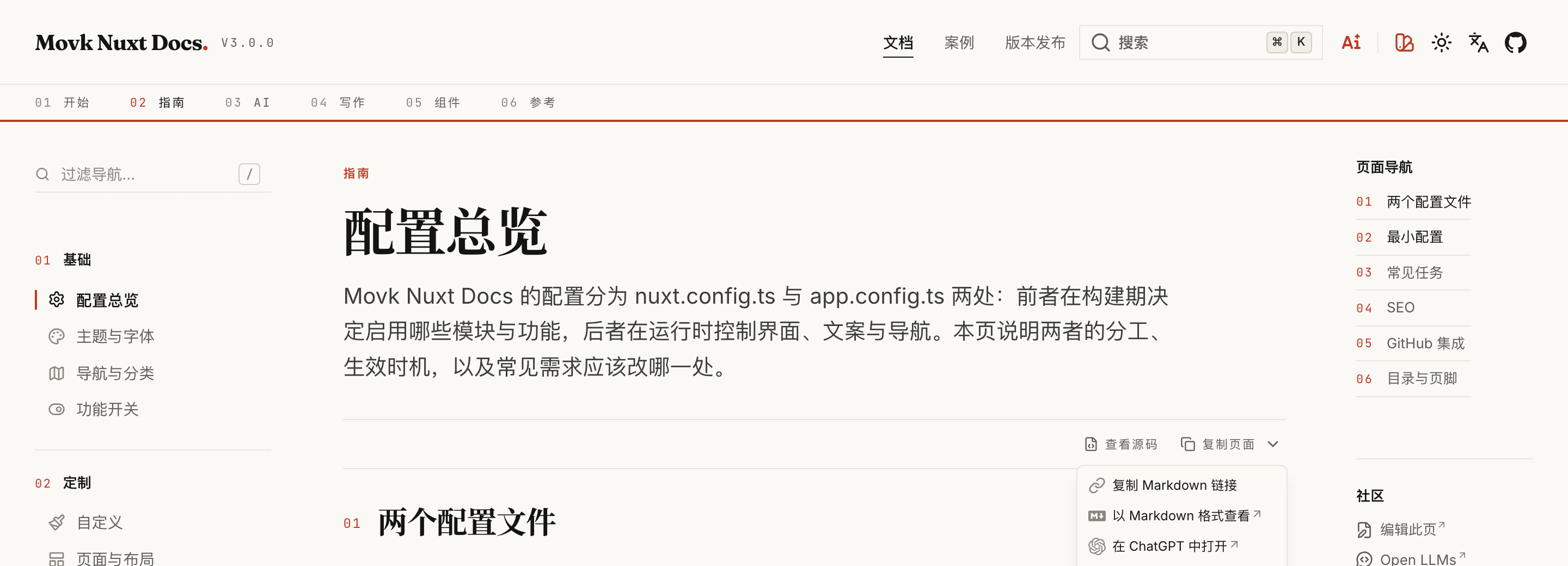
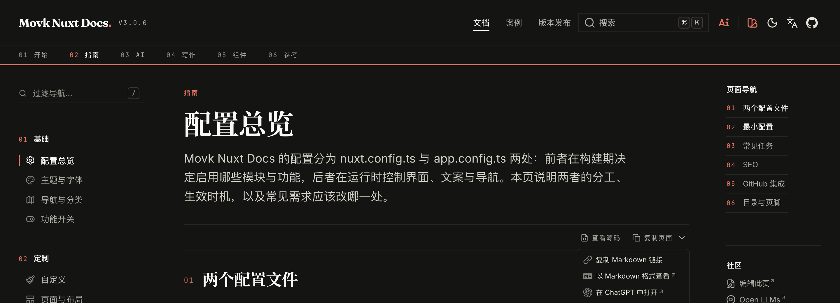
<script setup lang="ts">
const route = useRoute()
</script>

<template>
  <UButton
    :to="`/raw${route.path}.md`"
    target="_blank"
    label="Markdown"
    icon="i-lucide-file-text"
    size="xs"
    variant="link"
    color="neutral"
  />
</template>
DocsAsideLeftTop
The top of the left sidebar. By default it is the navigation filter, rendered only when aside.filter.enabled is on and the current section reaches the threshold, see Navigation & Categories.
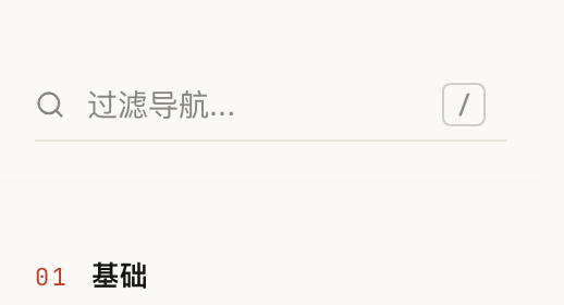
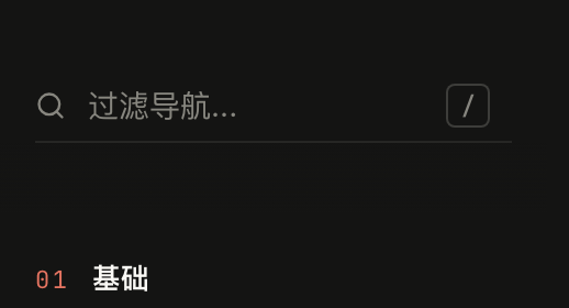
<script setup lang="ts">
const searchTerm = inject<Ref<string>>('docsFilterSearch', ref(''))
</script>

<template>
  <UInput v-model="searchTerm" icon="i-lucide-search" placeholder="Filter..." class="w-full" />
</template>
docsFilterSearch is the filter term provided by the docs layout; DocsAsideLeftBody filters the navigation with it.
DocsAsideLeftBody
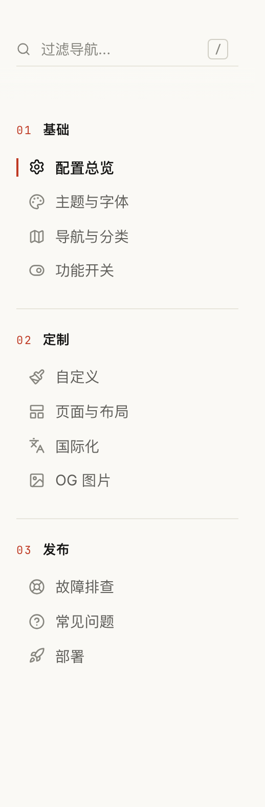
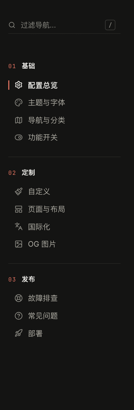
The body of the left sidebar: docs navigation grouped by section, with an indicator next to the current item that slides on navigation.
<script setup lang="ts">
const navigation = useDocsNavigation()
const { navigationByCategory } = useNavigation(navigation)
</script>

<template>
  <div v-for="group in navigationByCategory" :key="group.path" class="mb-6">
    <p class="mb-2 text-sm font-semibold">
      {{ group.title }}
    </p>
    <UContentNavigation :navigation="group.children" :collapsible="false" />
  </div>
</template>
DocsAsideRightBottom
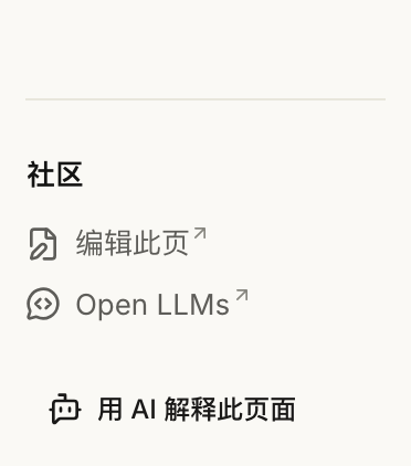
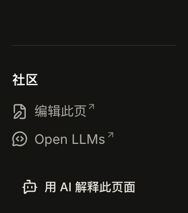
The area below the table of contents. By default it shows the "Explain with AI" button when AI Chat is enabled.
<template>
  <UPageLinks
    title="Community"
    :links="[{ label: 'Discussions', icon: 'i-lucide-messages-square', to: 'https://github.com/my/repo/discussions', target: '_blank' }]"
  />
</template>
Footer
Footer
The footer container, mounting FooterLeft and FooterRight on either side.


<template>
  <UFooter>
    <template #left>
      <FooterLeft />
    </template>

    <template #right>
      <FooterRight />
    </template>
  </UFooter>
</template>
FooterLeft
Renders footer.credits as MDC by default.


<template>
  <p class="text-sm text-muted">
    © 2026 My Team · Released under the MIT License
  </p>
</template>
FooterRight
Renders the icon buttons from footer.socials by default.


<script setup lang="ts">
const { footer } = useAppConfig()
</script>

<template>
  <div class="flex gap-1">
    <UButton
      v-for="link in footer.socials"
      :key="link.to"
      v-bind="link"
      color="neutral"
      variant="ghost"
    />
  </div>
</template>
Feature Flags
Optional features such as component docs, Mermaid, AI Chat and accessibility checks are controlled by switches in nuxt.config, and features that are off bundle none of their dependencies. This page lists each flag's default, the dependencies to install when enabling it, and what happens when it is off.
Pages & Layouts
Besides docs pages, the layer generates the landing page, a releases page and a showcase page from files in the content directory, and you can write any Vue page in app/pages. This page covers when each built-in route is generated and its content format, header and footer switches for custom pages, and the built-in layouts.