Built-in AI chat assistant
Overview
A Nuxt module that provides an AI chat interface powered by MCP (Model Context Protocol) tools.
Quick start
Movk Nuxt Docs already includes the AI Chat module. To enable it, apply the following configuration:
Add the module configuration in nuxt.config.ts:
export default defineNuxtConfig({
  extends: ['@movk/nuxt-docs'],
  aiChat: {
    model: 'zai/glm-4.7',
    models: [
      'zai/glm-4.7',
      'anthropic/claude-sonnet-4.6',
      'google/gemini-2.5-flash'
    ],
  }
})
Module configuration options:
| Option | Type | Default | Description |
|---|---|---|---|
apiPath | string | /api/ai-chat | The chat API endpoint path |
mcpPath | string | /mcp | The MCP server connection path |
model | string | - | The model identifier |
models | string[] | [] | The list of available models (in "provider/model" or "model" format) |
Configure the AI Chat features in app/app.config.ts:
export default defineAppConfig({
  aiChat: {
    floatingInput: true,
    explainWithAi: true,
    faqQuestions: [
      {
        category: 'Quick start',
        items: ['How do I install it?', 'How do I configure it?'],
      },
      {
        category: 'Advanced usage',
        items: ['How do I customize it?'],
      },
    ],
    shortcuts: {
      focusInput: 'meta_i'
    },
    texts: {
      title: 'AI Assistant',
      placeholder: 'Type your question...',
      // ... more text configuration
    }
  }
})
faqQuestions can be an object grouped by locale (e.g. { 'zh-CN': [...], 'en': [...] }), and the panel switches with the current locale.Set your API key as an environment variable:
# AI Gateway: a single key proxying multiple providers (recommended)
AI_GATEWAY_API_KEY=your-gateway-key

# Or connect directly to a built-in provider: configure as needed; the matching prefix bypasses the Gateway and uses the official SDK directly
DEEPSEEK_API_KEY=your-deepseek-key
ALIBABA_API_KEY=your-alibaba-key
ZHIPU_API_KEY=your-zhipu-key
AI_GATEWAY_API_KEY or any built-in provider key (see the table below) is present; if all are missing, the module is disabled and logs a message to the console.Automatic integration
By default, the following features are enabled automatically:
- AI Chat trigger button: shown on the right side of the page; clicking it opens the AI assistant panel
- Floating input: shown at the bottom of documentation pages (controlled via
appConfig.aiChat.floatingInput) - AI explain button: shown in the documentation sidebar (controlled via
appConfig.aiChat.explainWithAi)
Manual integration (optional)
If you need to use the AI Chat components on a custom page:
<template>
  <div>
    <AiChat />
    <AiChatPanel />
  </div>
</template>
app/app.config.ts, with no need to pass props in the component.Floating input
The floating input is integrated at the bottom of documentation pages by default. To use it on a custom page:
<template>
  <div>
    <Teleport to="body">
      <ClientOnly>
        <AiChatPanel />
        <AiChatFloatingInput />
      </ClientOnly>
    </Teleport>
  </div>
</template>
Teleport to render the floating input at the body level, ensuring it stays pinned to the bottom regardless of where it sits in the component hierarchyProgrammatic control
Use the useAIChat composable to control the chat:
<script setup>
const {
  isEnabled,
  isOpen,
  messages,
  toggleChat,
  open
} = useAIChat()

// Open the chat and send an initial message
open('How do I install this module?')

// Toggle chat visibility
toggle()
</script>
Customization
Custom model providers
import { modelProviderRegistry } from '#ai-chat/server/utils/modelProviders'
import { createAnthropic } from '@ai-sdk/anthropic'

export default defineNitroPlugin(() => {
  // Override the default provider configuration
  modelProviderRegistry.register('anthropic', ({ config, modelId }) => {
    const anthropic = createAnthropic({
      apiKey: config.anthropicApiKey,
      // Custom configuration...
    })
    return anthropic(modelId)
  })
})
Configure the environment variable:
ANTHROPIC_API_KEY=your_api_key
Built-in providers
After configuring the corresponding environment variable, models matching a prefix connect directly to the official SDK; models that do not match any prefix fall back to the AI Gateway. An optional <PROVIDER>_BASE_URL (e.g. ALIBABA_BASE_URL=https://dashscope.aliyuncs.com/compatible-mode/v1 to switch to Alibaba Cloud's China endpoint) overrides the endpoint/region. Registering the same prefix with modelProviderRegistry.register(prefix, ...) in server/plugins/ overrides the built-in implementation.
| Provider | Prefix | Environment variable |
|---|---|---|
| OpenAI | openai | OPENAI_API_KEY |
| Anthropic | anthropic | ANTHROPIC_API_KEY |
| DeepSeek | deepseek | DEEPSEEK_API_KEY |
| Alibaba Cloud Qwen | alibaba | ALIBABA_API_KEY |
| Zhipu GLM | zai | ZHIPU_API_KEY |
| AI Gateway | none (fallback) | AI_GATEWAY_API_KEY |
System prompt
To customize the AI's behavior, create or edit the system prompt in the following file:
server/api/ai-chat.ts
Styling
The components use Nuxt UI and Tailwind CSS design tokens. You can customize the appearance by modifying the component files or overriding UI properties.
API
AiChat
The simplest way to integrate, showing the assistant button.
View source codeAiChatFloatingInput
A floating input at the bottom of the viewport. Requires no props.
Keyboard shortcuts:
⌘I/Ctrl+I- focus the inputEscape- blur the inputEnter- submit the question
Teleport and ClientOnly to ensure it renders correctly.AiChatModelSelect
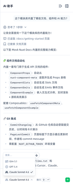
A model selection dropdown for switching AI models. Requires no props.
models list configured in nuxt.config.ts and uses the useModels composable to manage model state.AiChatPanel
The complete AI chat panel interface.
Features:
- An expandable/collapsible sidebar panel
- Automatically pushes the main content area
- Built-in message history and streaming responses
- Supports code highlighting and Markdown rendering
AiChatDisabled
The disabled-state component shown when the AI Chat feature is not enabled.
View source codeComposables
useAIChat()
Conversation state management, providing state control and message management for the chat interface.
Return values
useModels()
Model configuration management, controlling the list of available AI models and the currently selected model.
Return values
aiChat.models configuration in nuxt.config.ts.anthropic/claude-sonnet-4.6.useHighlighter()
Asynchronously loads a Shiki code highlighter instance, used for syntax highlighting of code blocks.
Return value
Returns a Promise that resolves to a configured Shiki Highlighter instance.
vue, js, ts, css, html, json, yaml, markdown, bashSupported themes:material-theme-palenight(dark mode)material-theme-lighter(light mode)
const highlighter = await useHighlighter()

// Usage example
const html = highlighter.codeToHtml(code, {
  lang: 'typescript',
  theme: 'material-theme-palenight'
})
useToolCall(state, toolName, input)
An extension point for AI chat tool calls, allowing you to customize the text label and icon shown when a tool is called.
When the AI assistant calls a tool, the AiChatPanel component calls this composable to get the display information for that tool. The default implementation returns an empty object, and the built-in tool labels are handled by the component itself. By overriding this composable in your application layer, you can add display support for custom tools.
Parameters
'output-available' means complete, other values mean in progress.name field in the MCP tool definition.Return values
i-lucide-search.Extending with custom tools
Create a composable of the same name in your application layer to override the default implementation:
import type { ToolState } from '#ai-chat/types'

export function useToolCall(state: ToolState, toolName: string, input: Record<string, string | undefined>) {
  const searchVerb = state === 'output-available' ? 'Searched' : 'Searching'
  const readVerb = state === 'output-available' ? 'Read' : 'Reading'

  const toolMessage: Record<string, string> = {
    'search-api': `${searchVerb} the API docs`,
    'get-schema': `${readVerb} the ${input.name || ''} type definition`,
  }

  const toolIcon: Record<string, string> = {
    'search-api': 'i-lucide-book-open',
    'get-schema': 'i-lucide-braces',
  }

  return {
    toolMessage,
    toolIcon,
  }
}
Default handling of built-in tools
The following tools are handled internally by AiChatPanel and do not need to be defined in useToolCall. The default handling is tailored to the MCP tools built into the current project, and a single configuration generates both the display text and the icon:
| Tool name | Display text | Icon |
|---|---|---|
search-documentation | Searching / Searched documentation pages, optionally with section and search filters | i-lucide-book-search |
search-composables | Searching / Searched composables, optionally with a search filter | i-lucide-braces |
search-icons | Searching / Searched icons, optionally with a query filter | i-lucide-search |
list-examples | Searching / Searched examples | i-lucide-codesandbox |
get-documentation-page | Reading / Read the {path} page | i-lucide-book-open |
get-example | Reading / Read the {exampleName} example | i-lucide-codepen |
get-component | Reading / Read the {componentName} component docs | i-lucide-box |
get-component-metadata | Reading / Read the {componentName} component metadata | i-lucide-file-code |
Deploy to production
Build and deploy Movk Nuxt Docs to Vercel or other hosting platforms, with details on the pnpm build command, the NUXT_GITHUB_TOKEN and AI_GATEWAY_API_KEY environment variables, and how Nitro automatically adapts to multi-platform deployment.
MCP Server
Every Movk Nuxt Docs instance includes a built-in Model Context Protocol server, exposed at the /mcp path. It supports mainstream AI tools such as Claude, Cursor, and VS Code, with built-in tools for documentation search and page retrieval, and can be extended with custom tools, resources, and prompts.