Customization
components/ directory to override a component.Header
The complete navigation system at the top of the page, composed of multiple sub-components.
Header
The main container component that brings together all header sub-components, including the logo, navigation menu, search, theme picker, and more.
You can fully customize the entire header structure by creating components/header/Header.vue.
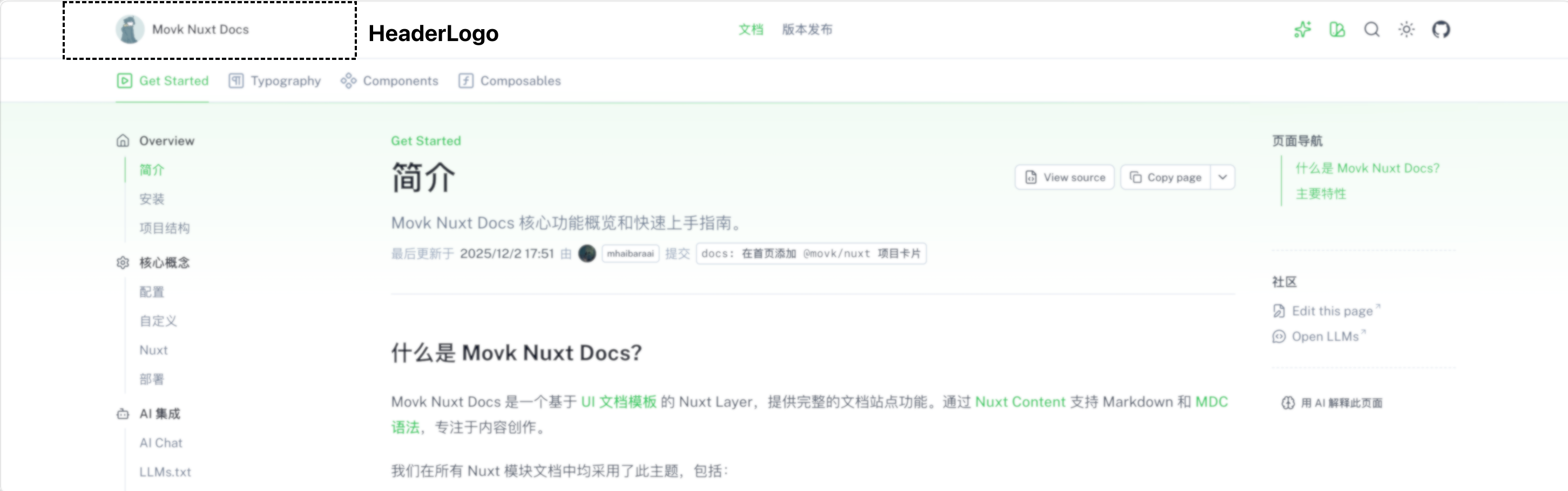
HeaderLogo
Displays the site logo and name, with link support.
HeaderCenter
The desktop navigation menu, which renders the configured navigation links using the UNavigationMenu component.
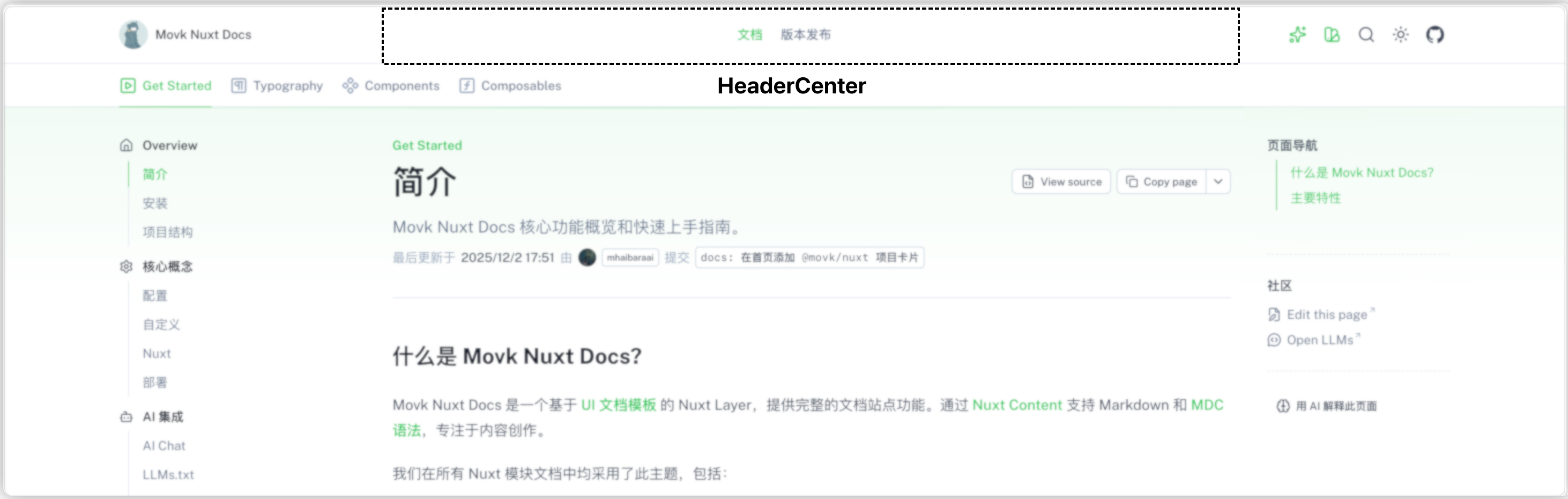
You can customize the menu content via desktopLinks from the useHeader() composable.
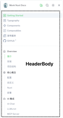
HeaderBody
The mobile navigation content, including the responsive navigation menu and the documentation table-of-contents navigation.
HeaderBottom
A secondary navigation dedicated to documentation pages, displaying the main documentation categories as tabs.
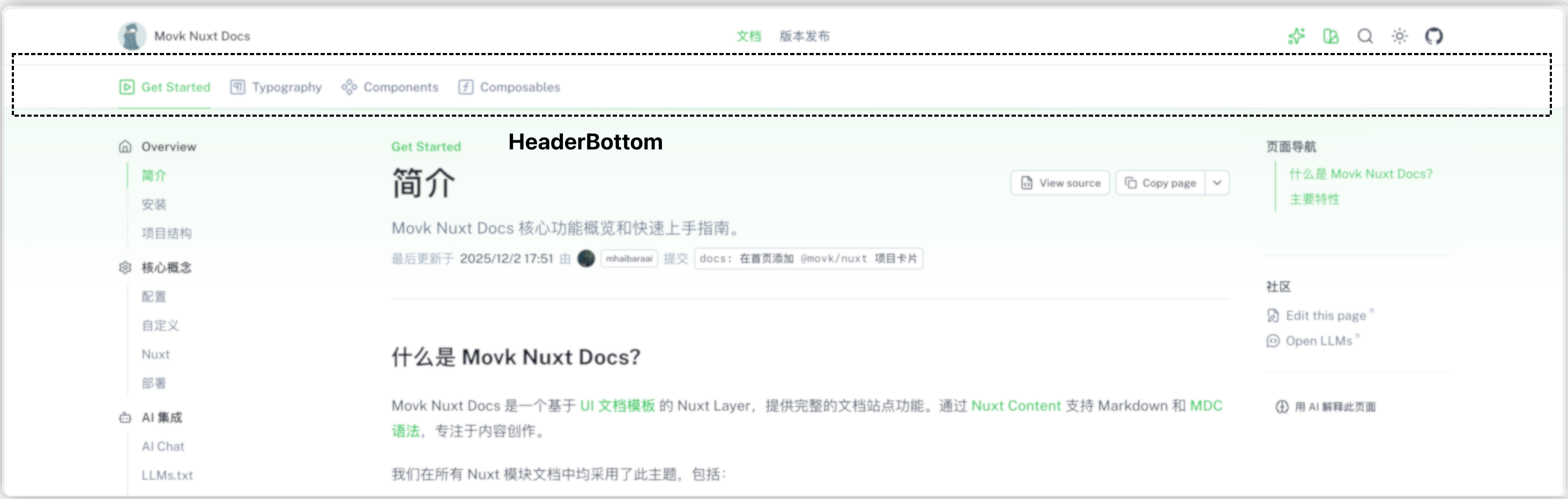
Only displayed when visiting /docs/ paths.
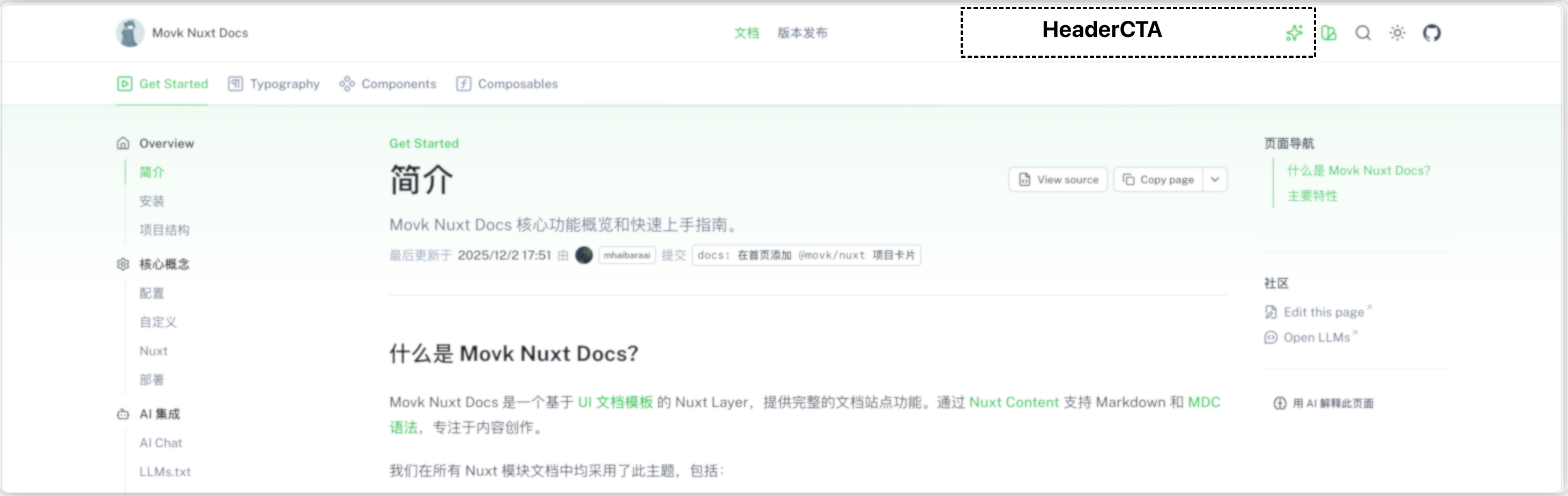
HeaderCTA
The call-to-action area on the right side of the header. By default it shows a "Get Started" button on the home page and the AI chat entry on other pages.
Page components
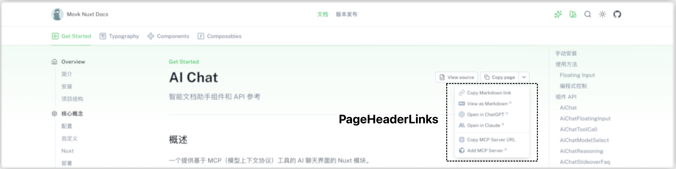
PageHeaderLinks
The action menu on the right side of a documentation page's title, providing features such as copy page, copy link, view source, AI chat, and MCP server by default.
DocsAsideLeftTop
The top slot of the left sidebar on documentation pages (the #top sticky area of UPageAside). By default it hosts the navigation filter box: shown when aside.filter.enabled is enabled and the number of navigation items in the current group reaches the threshold.
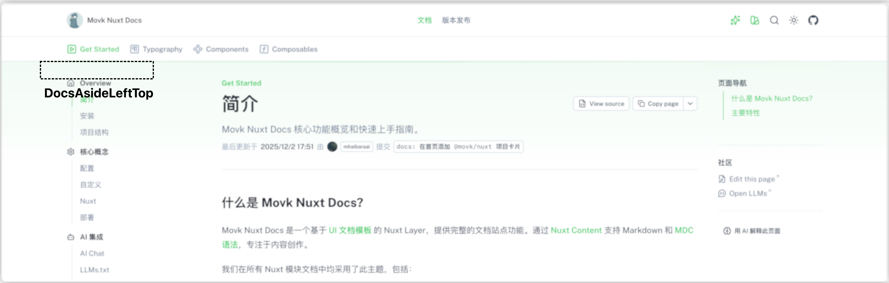
Create components/DocsAsideLeftTop.vue to display custom content above the left navigation.
DocsAsideLeftBody
The main content slot of the left sidebar on documentation pages. By default it renders the category navigation for the current documentation section, filtering by title and description when there is input in the filter box.
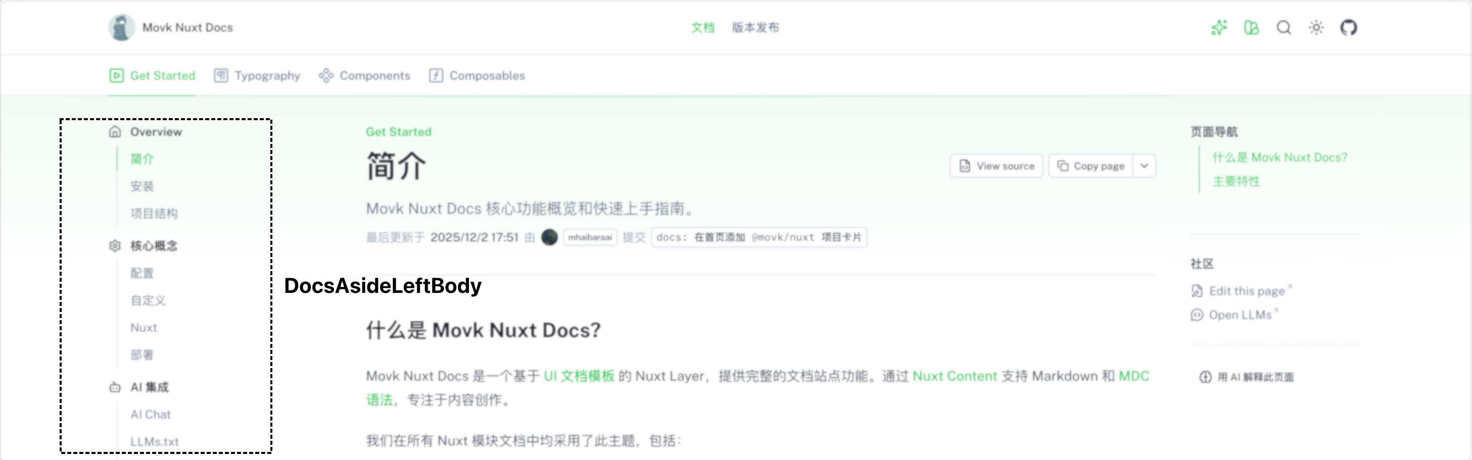
Create components/DocsAsideLeftBody.vue to display custom content in the main area of the left navigation.
DocsAsideRightBottom
The bottom slot of the right sidebar on documentation pages, an empty placeholder component by default.
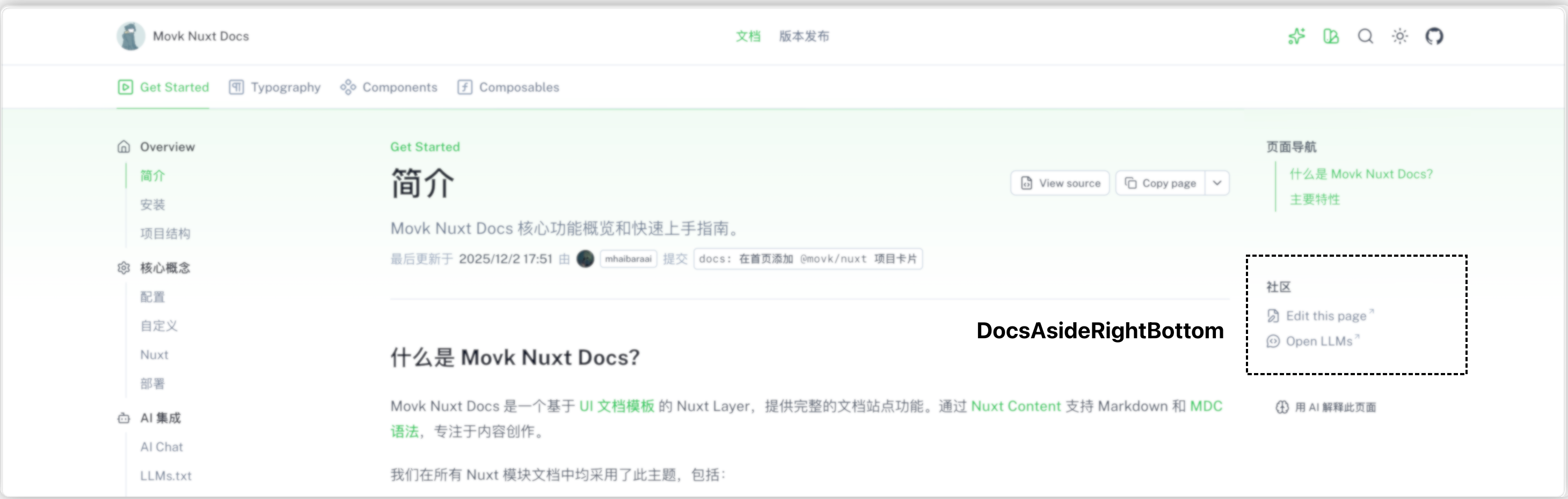
Create components/DocsAsideRightBottom.vue to display custom content below the right-hand table of contents.
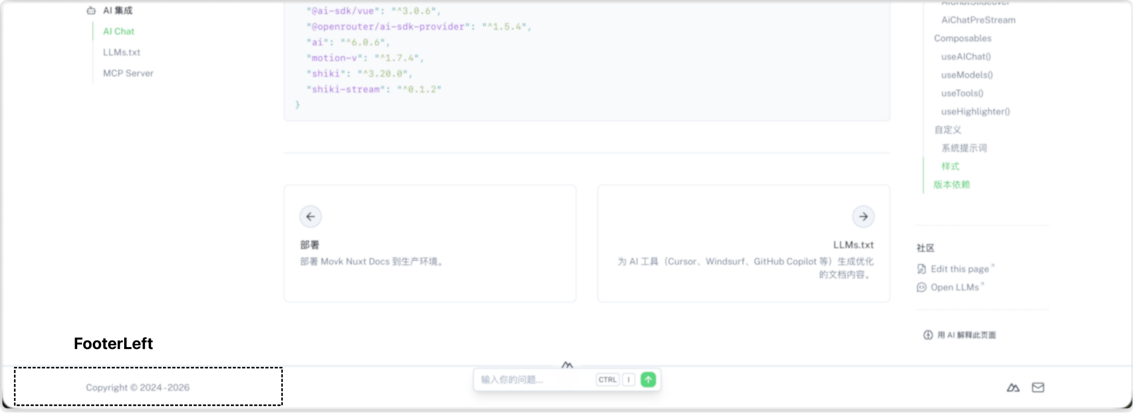
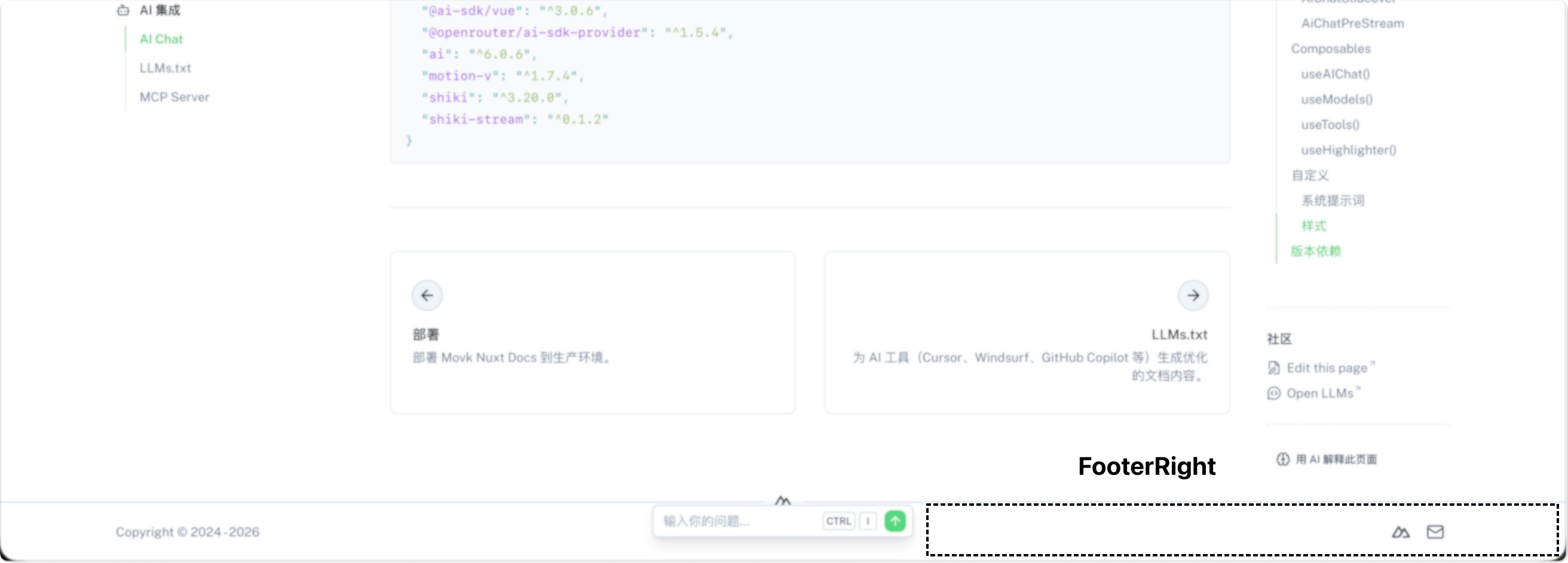
Footer
The layout component at the bottom of the page.
Footer
The main container component that brings together the left and right footer content, including the divider and layout styles.
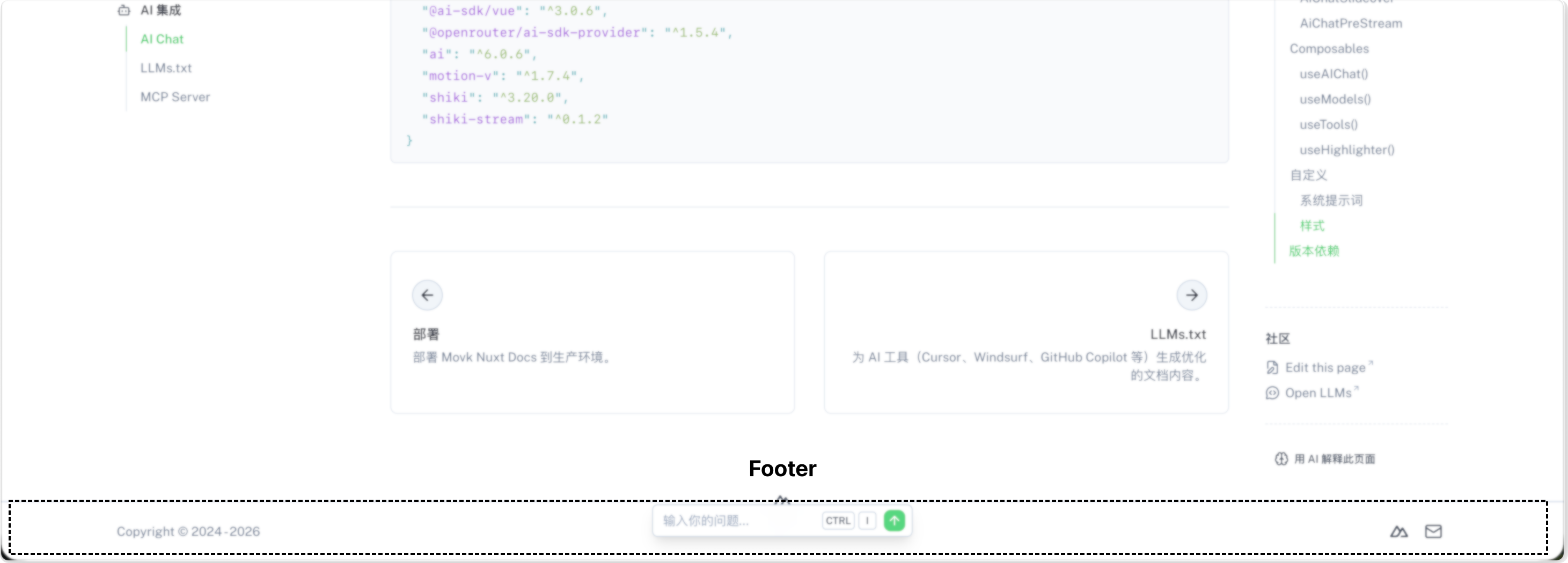
FooterLeft
The left footer area, which displays credits configured via footer.credits in app/app.config.ts.
FooterRight
The right footer area, which displays social media link buttons configured via footer.socials in app/app.config.ts.
ThemePicker
ThemePicker
A theme customization tool with a visual interface for adjusting:
- Primary: the primary color (can be set to black or a preset color)
- Neutral: the neutral color
- Radius: the border radius size (0-3)
- Font: font selection
- Icons: icon set selection
- Color Mode: color mode (light / dark / system)
After making changes, you can export the CSS variables or the app/app.config.ts configuration.
ThemePickerButton
A button component used internally by the theme picker for selecting options such as colors and border radius.
Default component codeConfigure your documentation site
A complete reference for customizing SEO metadata, header navigation, footer credits, sidebar navigation filtering, and the AI Chat interface via app.config.ts, as well as configuring module-level options such as GitHub integration, component metadata generation, Mermaid diagrams, and accessibility via nuxt.config.ts.
Nuxt
Learn how to take advantage of the Nuxt pages and layouts system in Movk Nuxt Docs, including creating custom Vue pages, configuring automatic Releases routing, the three Releases page modes (YAML / Markdown / hybrid), the Templates showcase page, and how to use the built-in default and docs layouts.